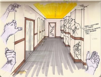
For me, this concept was perfect since my thesis project is an art/design incubator facility. Below is one of my initial sketches showing the entry way to a retail space with a giant wall mural of sketched hands. This becomes a literal translation of art into space and shows the importance of the hand - an artist's most valuable tool.
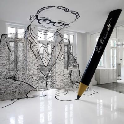
I was initially inspired by the Leo Burnett Office by Ministry of Design (Singapore)
- Painted mural of the company's founder
And before I knew it, I began to notice all of these other spaces...
School of Life by Susanna Edwards (London, England)
- Hand drawn by Charlotte Mann
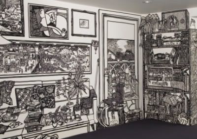
The Smokehouse Deli by The Busride (Delhi, India)
- Hand illustrated over a 25 day period
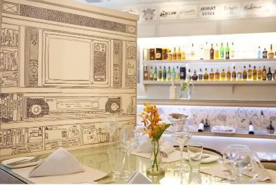
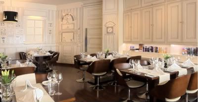
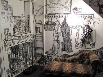
Gift Shop by Belenko (Odessa, Ukraine)
- Painted onto walls and furniture
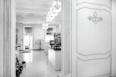
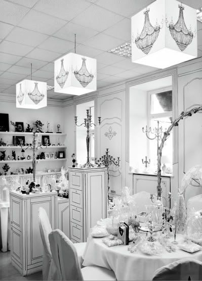
I find the literal translation of a drawing into space or playing with the concept of 2D versus 3D really intriguing and I also think that it creates quite an impact . What do you think of this trend?

9 comments:
Wow. The hand drawn and painted walls are crazy amazing. Very unique and interesting. Thanks for posting!
http://www.kentucky.com/2008/09/23/532854/man-decorates-basement-with-10.html
Absolutely beautiful pics! Gorgeous blog!
Heck yes to hand drawn design. One of my friends did her bedroom in a Marie Antoinette fashion all with sharpie markers.
Amazing illustrations, darling!
I love this trompe l'oeil trend!
xoxox,
CC
What cool findings!!
I just took the time to figure out how to add links to my blog - you are on the list my friend!
Also- I was playing with templates too and made some super cool changes!
Happy Senior Thesis to you!
great illustrations man.
Cool banana.
I have not seen this look before, but I have to say, I love it. I could see those "2D" chandeliers going totally commercial via someplace like Urban Outfitters. This is really the opposite of trompe l'oeil - the point is to not look real!
Vivian - Thanks for stopping by & commenting! These spaces are quite captivating
Danyelle - Thanks for sharing that link, that guy MUST be the one responsible for the trend haha
Gant Jeans - Thank you so much! Compliments like that make me so happy :)
Dapper Kid - I have missed you, hope all is well! I cannot believe your friend actually did this! How long did it take? I'd love to see a picture if you can get a hold of one.
Couture Carrie - Amazing indeed. Thanks for stopping by :D
Anna - Thanks so much for adding me to your links section. I saw your changes and I am really liking them! Nice work! P.S. I am writing this comment from the lab. Hello last 20 days of the senior thesis.
Jamie - Thanks for commenting man. Haha, you're illustrations are awesome!
Sanity Fair - I totally agree with you, this concept could be perfect of UO or maybe Topshop.
Post a Comment